Author Archives: Charles Boccadoro

About Charles Boccadoro

Charles Boccadoro, BS (MIT), Post Graduate Diploma (von Karman Institute, BELGIUM). Associate editor, data wizard. Described by Popular Science as “enthusiastic, voluble and nattily-dressed,” Charles describes himself as “a recently retired aerospace engineer.” He doesn’t brag about a 30 year career that included managing Northrop Grumman’s Quiet Supersonic Platform and Future Strike Systems projects, working with NASA and receiving a host of industry accolades. Charles is renowned for thoughtful, data-rich analyses and is the driving force behind the Observer’s fund ratings and fund screeners.

Three Alarm Funds Redux

By Charles Boccadoro

Originally published in December 1, 2013 Commentary

alarm bellsRoy Weitz first published the legacy Three Alarm fund list in 1996. He wanted to help investors decide when to sell mutual funds. Being on the list was not an automatic sell, but a warning signal to look further and see why.

“I liken the list to the tired old analogy of the smoke detector. If it goes off, your house could be on fire. But it could also be cobwebs in the smoke detector, in which case you just change the batteries and go back to sleep,” he explained in a 2002 interview.

Funds made the list if they trailed their benchmarks for the past 1, 3, and 5 year periods. At the time, he grouped funds into only five equity (large-cap, mid-cap, small-cap, balanced, and international) and six specialty “benchmark categories.” Instead of pure indices, he used actual funds, like Vanguard 500 Index Fund VFINX, as benchmarks. Occasionally, the list would catch some heat because “mis-categorization” resulted in an “unfair” rating. Some things never change.

At the end of the day, however, Mr. Weitz wanted “to highlight the most serious underperformers.” In that spirit, MFO will resurrect the Three Alarm fund list, which will be updated quarterly along with the Great Owl ratings. Like the original methodology, inclusion on the list will be based entirely on absolute, not risk-adjusted, returns over the past 1, 3, and 5 year periods.

Since 1996, many more fund categories exist. Today Morningstar assigns over 90 categories across more than 7500 unique funds, excluding money market, bear, trading, volatility, and specialized commodity. MFO will rate the new Three Alarm funds using the Morningstar categories. We acknowledge that “mis-categorization” may occasionally skew the ratings, but probably much less than if we tried to distill all rated funds into just 11 or so categories.

For more than two-thirds of the categories, one can easily identify a reasonable “benchmark” or reference fund, thanks in part to the proliferation of ETFs. Below is a sample of these funds, sorted first by broad investment Type (FI – Fixed Income, AA – Asset Allocation, EQ – Equity), then Category:

benchmarks

Values in the table include the 3-year annualized standard deviation percentage (STDEV), as well as annualized return percentages (APR) for the past 1, 3, and 5 year periods.

A Return Rating is assigned based how well a fund performs against other funds in the same category during the same time periods. Following the original Three Alarm nomenclature, best performing funds rate a “2” (highlighted in blue) and the worst rate a “-2” (red).

As expected, most of the reference funds rate mid range “0” or slightly better. None produce top or bottom tier returns across all evaluation periods. The same is true for all 60 plus category reference funds. Selecting reference funds in the other 30 categories remains difficult because of their diversity.

To “keep it simple” MFO will include funds on the Three Alarm list if they have the worst returns in their categories across all three evaluation periods. More precisely, Three Alarm Funds have absolute returns in the bottom quintile of their categories during the past 1, 3, and 5 years. Most likely, these funds have also under-performed their “benchmarks” over the same three periods.

There are currently 316 funds on the list, or fewer than 6% of all funds rated. Here are the Three Alarm Funds in the balanced category, sorted by 3 year annualized return:

balanced

Like in the original Three Alarm list, a fund’s Risk Rating is assigned based a “potential bad year” relative to other funds in the same category. A Risk Rating of “2” (highlighted in red) goes to the highest risk funds, while “-2” (blue) goes to the lowest risk funds. (Caution: This rating measures a fund’s risk relative to other funds in same category, so a fund in a high volatility category like energy can have high absolute risk relative to market, even if it has a low risk rating in its category.)

“Risk” in this case is based on the 3 year standard deviation and return values. Specifically, two standard deviations are subtracted from the return value. The result is then compared with other funds in the category to assign a rating. The rating is a little more sensitive to downside than the original measure as investors have experienced two 50% drawdowns since the Three Alarm system was first published.

While never quite as popular as the Three Alarm list, Mr. Weitz also published an Honor Roll list. In the redux system, Honor Roll funds have returns in the top quintile of their categories in the past 1, 3, and 5 years. There are currently 339 such funds.

The Three Alarm, Honor Roll, and Reference funds can all be found here.

06Nov2013/Charles

Comparing Lists of “Best Funds”

By Charles Boccadoro

Originally published in November 1, 2013 Commentary

Last month David pointed out how little overlap he found between three popular mutual fund lists: Kiplinger 25, Money 70, and Morningstar’s Fantastic 51. David mused: “You’d think that if all of these publications shared the same sensible goal – good risk-adjusted returns and shareholder-friendly practices – they’d also be stumbling across the same funds. You’d be wrong.”

He found only one fund, Dodge & Cox International Fund DODFX, on all three lists. Just one! Although just one is a statistically better outcome than randomly picking three such lists from the 6600 or so mutual funds and 1000 ETFs, it does seem surprisingly small. 

Opening up the field a little, by replacing the Fantastic 51 with a list of 232 funds formed from Morningstar’s current “Gold-Rated Funds” and “Favorite ETFs,” the overlap does not improve much. Just two funds appear in all three publications: DODFX and Habor Bond Institutional HABDX. Just two!

While perhaps not directly comparable, the table below provides a quick summary of the criteria used by each publication. Money 70 criteria actually include Morningstar’s so-called stewardship grade, which must be one of the least maintained measures. For example, Morningstar awarded Bruce Berkowitz Fund Manager of the Decade, but it never published a stewardship grade for Fairholme.

comparison

Overall, however, the criteria seem quite similar, or as David described “good risk-adjusted returns and shareholder-friendly practices.”  Add in experienced managers for good measure and one would expect the lists to overlap pretty well. But again, they don’t.

How do the “forward-looking” recommendations in each of these lists fare against Morningstar’s purely quantitative “backward-looking” performance rating system? Not as well as you might think. There are just seven 5-star funds on Money’s list, or 1-in-10. Kiplinger does the best with six, from a percentage perspective, or almost 1-in-4. (They must have peeked.) Morningstar’s own list includes 44 5-star funds, or about 1-in-5. So, as well intentioned and “forward looking” as these analysts certainly try to be, only a small minority of their “best funds” have delivered top-tier returns.

On the other hand, they each do better than picking funds arbitrarily, if not unwittingly, since Morningstar assigns 5 stars to only about 1-in-17 funds. Neither of the two over-lapping funds that appear on all three lists, DODFX and HABDX, have 5 stars. But both have a commendable 4 stars, and certainly, that’s good enough.

Lowering expectations a bit, how many funds appear on at least two of these lists? The answer: 38, excluding the two trifectas. Vanguard dominates with 14. T. Rowe Price and American Funds each have 4. Fidelity has just one. Most have 4 stars, a few have 3, like SLASX, probably the scariest.

But there is no Artisan. There is no Tweedy. There is no Matthews. There is no TCW or Doubleline. There are no PIMCO bond funds. (Can you believe?) There is no Yacktman. Or Arke. Or Sequoia. There are no funds less than five years old. In short, there’s a lot missing.

There are, however, nine 5-star funds among the 38, or just about 1-in-4. That’s not bad. Interestingly, not one is a fixed income fund, which is probably a sign of the times. Here’s how they stack-up in MFO’s own “backward looking” ratings system, updated through September:

3q

Four are moderate allocation funds: FPACX, PRWCX, VWELX, and TRRBX. Three are Vanguard funds: VWELX, VDIGX, and VASVX. One FMI fund FMIHX and one Oakmark fund OAKIX. Hard to argue with any of these funds, especially the three Great Owls: PRWCX, VWELX, and OAKIX.

These lists of “best funds” are probably not a bad place to start, especially for those new to mutual funds. They tend to expose investors to many perfectly acceptable, if more mainstream, funds with desirable characteristics: lower fees, experienced teams, defensible, if not superior, past performance.

They probably do not stress downside potential enough, so any selection needs to also take risk tolerance and investment time-frame into account. And, incredulously, Morningstar continues to give Gold ratings to loaded funds, about 1-in-7 actually.

The lists produce surprisingly little overlap, perhaps simply because there are a lot of funds available that satisfy the broad screening criteria. But within the little bit of overlap, one can find some very satisfying funds.

 Money 70 and Kiplinger 25 are free and online. Morningstar’s rated funds are available for a premium subscription. (Cheapest path may to subscribe for just one month each year at $22 while performing an annual portfolio review.)

As for a list of smaller, less well known mutual funds with great managers and intriguing strategies? Well, of course, that’s the niche MFO aspires to cover.

23Oct2013/Charles

Permanent Loss of Capital

By Charles Boccadoro

Originally published in November 1, 2013 Commentary

The father of value investing, Benjamin Graham, employed the concept of “Margin of Safety” to minimize risk of permanent loss. His great student, Warren Buffett, puts it like this: “Rule No. 1: never lose money; rule No. 2: don’t forget rule No. 1.”

Zachary Wydra, portfolio manager of the 5-star Beck Mack & Oliver Partners (BMPEX) fund, actually cited Mr. Buffett’s quote during the recent MFO conference call.

But a look at Berkshire Hathaway, one of the great stocks of all time, shows it dropped 46% between December 2007 and February of 2009. And, further back, it dropped about the same between June 1998 and February 2002. So, is Mr. Buffett not following his own rule? Similarly, a look at BMPEX shows an even steeper decline in 2009 at -54%, slightly worse than the SP500.

The distinction, of course, is that drawdown does not necessarily mean loss, unless one sells at what is only a temporary loss in valuation – as opposed to an unrecoverable loss, like experienced by Enron shareholders. Since its 2009 drawdown, BMPEX is in fact up an enviable 161%, beating the SP500 by 9%.

Robert Arnott, founder of Research Associates, summarizes as follows: “Temporary losses of value are frequent; at times they can become so frightening that they become permanent—for those that sell.” Distinguishing between temporary drawdown and permanent loss of capital (aka “the ultimate risk”) is singularly the most important, if unnerving, aspect of successful value investing.

Mr. Wydra explains his strategy is to target stocks that have an upside potential over the next three years of at least 50% and will not lose value over that time. Translation: “loss,” as far as BMPEX is concerned, equates to no drawdown over a three year period. A very practical goal indeed, since any longer period would likely not be tolerated by risk adverse investors.

And yet, it is very, very hard to do, perhaps even impossible for any fund that is primarily long equities.

Here is downside SP500 total return performance looking back about 52 years:

sp5003yr

It says that 3-year returns fall below zero over nearly 30% of the time….and fall below 20% nearly half of that time. If we compare returns against consumer price index (CPI), the result is even worse. But for simplicity (and Pete’s) sake, we will not. Fact is, over this time frame, one would need to have invested in the SP500 for nearly 12 years continuously to guarantee a positive return. 12 years!

How many equity or asset allocation funds have not experienced a drawdown over any three year period? Very few. In the last 20 years, only four, or about 1-in-1000. Gabelli ABC (GABCX) and Merger (MERFX), both in the market neutral category and both focused on merger arbitrage strategies. Along with Permanent Portfolio (PRPFX) and Midas Perpetual Portfolio (MPREX), both in the conservative allocation category and both with large a percentage of their portfolios in gold. None of these four beat the SP500. (Although three beat bonds and GABCX did so with especially low volatility.)

nodrawdown
So, while delivering equity-like returns without incurring a “loss” over a three year period may simply prove too high a goal to come true, it is what we wish was true.

29Oct2013/Charles

FundX Upgrader Fund (FUNDX), September 2013

By Charles Boccadoro

FundX Upgrader Fund(FUNDX) is now FundX ETF(XCOR) – January 24, 2023

Objective and Strategy

The FUNDX Upgrader Fund seeks to maximize capital appreciation. It is a fund of active or passive funds and ETFs. 70% of the portfolio is in “core funds” which pursue mainstream investments (e.g., Oakmark Global OAKGX), 30% are more aggressive and concentrated funds (e.g., Wasatch Intl Growth WAIGX and SPDR S&P Homebuilders XHB). FUNDX employs an “Upgrading” strategy in which it buys market leaders of the last several months and sells laggards. The fund seems to get a lot of press about “chasing winners,” which at one level it does. But more perhaps accurately, it methodically attempts to capitalize on trends within the market and not be left on the sidelines holding, for example, an all-domestic portfolio when international is experiencing sustained gains.

The advisor’s motto: “We’re active, flexible, and strategic because markets CHANGE.”

Advisor

FundX Investment Group (formerly DAL Investment Company, named after its founder’s children, Douglas and Linda) is the investment advisor, based in San Francisco. It has been providing investment advisory services to individual and institutional investors since 1969. Today, it invests in and provides advice on mutual fund performance through individual accounts, its family of eight upgrader funds, and publication of the NoLoad FundX newsletter.

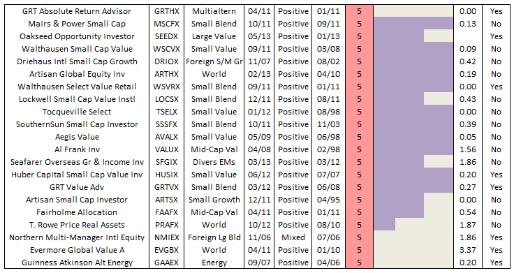
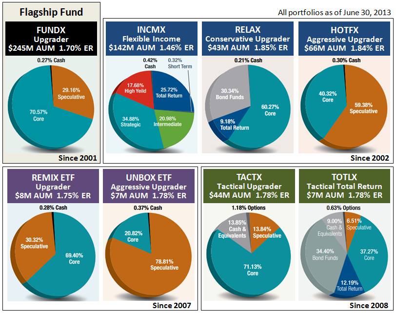
As of December 31, 2012, the advisor had nearly $900M AUM. About half is in several hundred individual accounts. The remaining AUM is held in the eight funds. All share similar upgrading strategies, but focused on different asset classes and objectives (e.g., fixed income bonds, moderate allocation, aggressive). The figure below summarizes top-level portfolio construction of each upgrader fund, as of June 30, 2013. Two are ETFs. Two others employ more tactical authority, like holding substantial cash or hedging to reduce volatility. FUNDX is the flagship equity fund with assets of $245M. 

2013-08-30_1615 (1)

Managers

All FundX funds are managed by the same team, led by FundX’s president Janet Brown and its CIO Jason Browne.  Ms. Brown joined the firm in 1978, became immersed with its founder’s methodology of ranking funds, assumed increasing money management responsibilities, became editor of their popular newsletter, then  purchased the firm in 1997. Ms. Brown graduated from San Diego State with a degree in art and architecture.  Mr. Browne joined the firm in 2000. He is a San Francisco State graduate who received his MBA from St Mary’s College. The other managers are Martin DeVault, Sean McKeon, and Bernard Burke. They too are seasoned in the study of mutual fund performance. That’s what these folks do.

Strategy Capacity and Closure

FUNDX would likely soft close between $1-1.5B and hard close at $2B, since the other funds and client portfolios use similar strategies. Mr. Browne estimates that the strategy itself has an overall capacity of $3B. In 2007, FUNDX reached $941M AUM. The portfolio today holds 26 underlying funds, with about 50% of assets in just seven funds, which means that the funds selected must have adequate liquidity.

Management Stake in the Fund

Ms. Brown has over $1M in FUNDX and between $100K and $1M in nearly all the firm’s funds. Mr. Browne too invests in all the funds, his largest investment is in tactically oriented TACTX where he has between $100K and $500K. The remaining team members hold as much as $500K in FUNDX and the fixed income INCMX, with smaller amounts in the other funds. None of the firm’s Independent Trustees, which include former President of Value Line, Inc. and former CEO of Rockefeller Trust Co., invest directly in any of the funds, but some hold individual accounts with the firm.

Opening Date

FUNDX was launched November 1, 2001. Its strategy is rooted in the NoLoad FundX Newsletter first published in 1976.

Minimum Investment

$1,000, reduced to $500 for accounts with an automatic investment plan.

Expense Ratio

1.70% as assets of $242 million (as of August 2013).

Comments

“Through bull and bear markets, Hulbert has emerged as the respected third-party authority on investment newsletters that consistently make the grade…for more than three decades, NoLoad FundX has emerged as a top performer in the Hulbert Financial Digest,” which is praise often quoted when researching FundX.

In a recent WSJ article, entitled “Chasing Hot Mutual-Fund Returns,” Mr. Hulbert summarizes results from a FundX study on fund selection, which considered over 300 funds at least two decades old. The study shows that since 1999, a portfolio based on top performing funds of the past year, like that used in the upgrader strategy, well outperforms against SP500 and a portfolio based of top performing funds of the last 10 years.

Hulbert Financial Digest does show the NoLoad FundX newsletter performance ranks among top of all newsletters tracked during the past 15 years and longer, but actually ranks it in lower half of those tracked for the last 10 years and shorter.

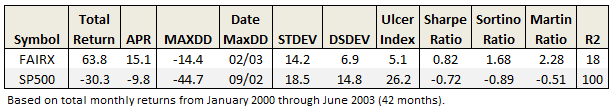
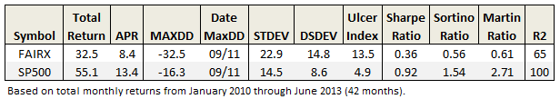
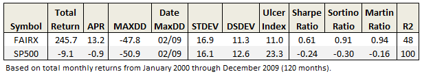
A look at FUNDX performance proper shows the flagship fund does indeed best SP500 total return. But a closer look shows its over-performance occurred only through 2007 and it has trailed every year since.

2013-08-27_0554

2013-09-01_0544

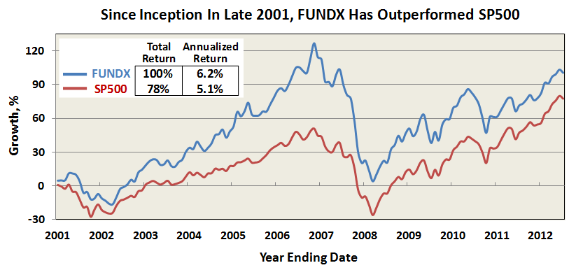
Comparisons against S&P 500 may be a bit unfair, since by design FUNDX can be more of an all-cap, global equity fund.  The fund can incrementally shift from all domestic to all foreign and back again, with the attendant change in Morningstar categorization. But Ms. Brown acknowledged the challenge head-on in a 2011 NYT interview: “As much as people in the fund industry may want to measure their performance against a very narrowly defined index, the reality is that most people judge their funds against the SP500, for better or worse.”

Asked about the fall-off, Mr. Browne explained that the recent market advance is dominated by S&P 500. Indeed, many all-cap funds with flexible mandate, like FUNDX, have actually underperformed the last few years. So while the fund attempts to capture momentum of market leaders, it also maintains a level of diversification, at least from a risk perspective, that may cause it to underperform at times. Ideally, the strategy thrives when its more speculative underlying funds experience extended advances of 10 months and more, in alignment with similar momentum in its core funds.

Crucial to their process is maintaining the universe of quality no-load/load-waived funds on which to apply its upgrading strategy. “We used to think it was all about finding the next Yacktman, and while that is still partially true, it’s just as important to align with investment style leaders, whether it is value versus growth, foreign versus domestic, or large versus small.”

Today, “the universe” comprises about 1200 funds that offer appropriate levels of diversification in both investment style and downside risk. He adds that they are very protective when adding new funds to the mix in order to avoid excessive duplication, volatility, or illiquidity. With the universe properly established, the upgrading strategy is applied monthly. The 1200 candidate funds get ranked based on performance of the past 1, 3, 6, and 12 months. Any holding that is no longer in the top 30% of its risk class gets replaced with the current leaders.

Both Ms. Brown and Mr. Browne make to clear that FUNDX is not immune to significant drawdown when the broad market declines, like in 2008-2009. In that way, it is not a timing strategy. That technique, however, can be used in the two more tactical upgrader funds TACTX and TOTLX.

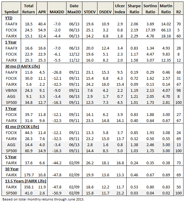
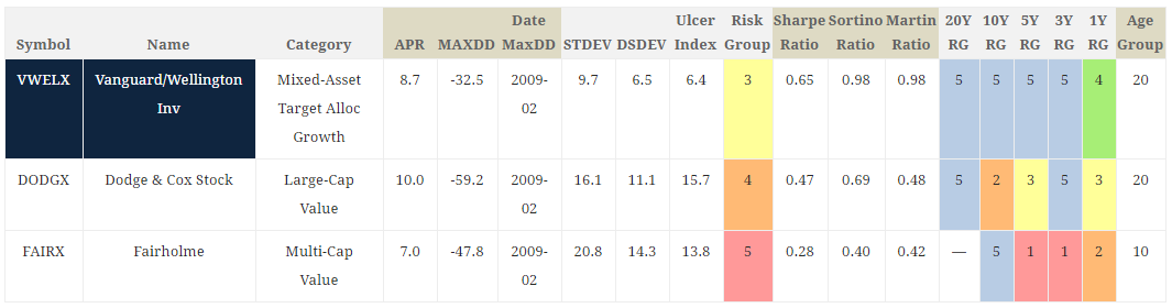
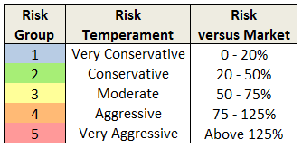
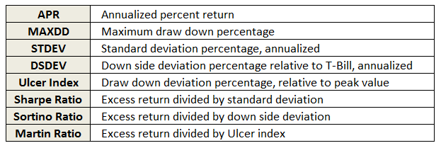
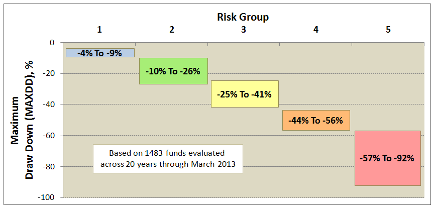
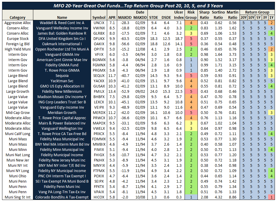
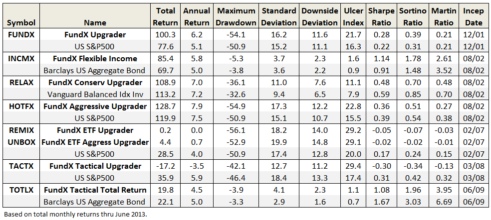
The table below summarizes lifetime risk and return numbers for FUNDX, as well as the other upgrader funds. Reference indices over same periods are included for comparison. Over longer term the four upgrader funds established by 2002 have held-up quite well, if with somewhat higher volatility and maximum drawdown than the indices. Both ETFs have struggled since inception, as has TACTX.

2013-08-31_0939

I suspect that few understand more about mutual fund performance and trends than the folks at FundX. Like many MFO readers, they fully appreciate most funds do not lead persistently and that hot managers do not stay on-top. Long ago, in fact, FundX went on record that chronic underperformance of Morningstar’s 5-star funds is because time frames considered for its ratings “are much too long to draw relevant conclusions of how a fund will do in the near future.” Better instead to “invest based on what you can observe today.” And yet, somewhat ironically, while the upgrading strategy has done well in the long term, FUNDX too can have its time in the barrel with periods of extended underperformance.

While the advisor campaigns against penalizing funds for high expenses, citing that low fees do not guarantee top performance, it’s difficult to get past the high fees of FUNDX and the upgrader funds. The extra expense layer is typical with fund-of-funds, although funds which invest solely in their own firm’s products (e.g., the T. Rowe Price Spectrum Funds and Vanguard STAR VGSTX) are often exceptions.

Bottom Line

It is maddeningly hard, as Value Line and FundX have certainly discovered, to translate portfolios which look brilliant in newsletter systems into actual mutual funds with distinguished records.   The psychological quirks which affect all investors, high operating expenses, and the pressure to gain and retain substantial AUM all erode even the best-designed system.

It might well be that FUNDX’s weak performance in the past half-decade is a statistical anomaly driven by the failure of its system to react quickly enough to the market’s bottoming in the first quarter of 2009 and its enormous surge in the second.   Those sorts of slips are endemic to quant funds.  Nonetheless, the fund has not outperformed a global equity benchmark two years in a row for more than a decade and trails that benchmark by about 1% per year for the decade.   The fact that the FundX team faces those challenges despite access to an enormous amount of data, a clear investment discipline and access to a vast array of funds serves as a cautionary tale to all of us who attempt to actively manage our fund portfolios.

Website

The FundX Investment Group, which links to its investment services, newsletter, and upgrader funds. The newsletter, which can be subscribed on-line for $89 annual, is chock full of good information.

FundX Upgrader Website, this also lists the 2013 Q3 report under the Performance tab.

Fact Sheet

Charles/31Aug2013

Dashboard of MFO Profiled Funds

By Charles Boccadoro

Originally published in August 1, 2013 Commentary

Each month, David provides in-depth analysis of two to four funds, continuing a FundAlarm tradition. Today, more than 75 profiles are available on MFO Funds index page. Most are quite current, but a few date back, under “Archives of FundAlarm,” so reference appropriately.

This month we roll out a new summary or “dashboard” of the many profiled funds. It’s intended to help identify funds of interest, so that readers can better scroll the index to retrieve in-depth profiles.

The dashboard presents funds by broad investment type, consistent with MFO Rating System. The three types are: fixed income, asset allocation, and equity. (See also Definitions page.)

Here is dashboard of profiled fixed income and asset allocation funds:

charles1

For each fund, the dashboard identifies current investment style or category as defined by Morningstar, date (month/year) of latest profile published, fund inception date (from first whole month), and latest 12-month yield percentage, as applicable.

Risk group is also identified, consistent with latest MFO rating. In the dashboard, funds with lowest risk will generally be at top of list, while those with highest risk will be at bottom, agnostic of M* category. Probably good to insert a gentle reminder here that risk ratings can get elevated, temporarily at least, when funds hit a rough patch, like recently with some bond and all-asset funds.

The dashboard also depicts fund absolute return relative to cash (90-day T-Bill), bonds (US Aggregate TR), and stocks (S&P 500 TR), again agnostic of M* category. If a fund’s return from inception through the latest quarter exceeds any of these indices, “Return Beats…” column will be shaded appropriately.

The Enhanced Strategy column alerts readers of a fund’s use of leverage or hedge via short positions, or if a fund holds any derivatives, like swaps or futures. If so, regardless of how small, the column will show “Yes.” It’s what David calls a kind of complexity flag. This assessment is strictly numerical using latest portfolio allocations from Morningstar’s database in Steele Mutual Fund Expert.

Finally, the column entitled “David’s Take” is a one-word summary of how each fund was characterized in its profile. Since David tends to only profile funds that have promising or at least intriguing strategies, most of these are positive. But every now and then, the review is skeptical (negative) or neutral (mixed).

We will update the dashboard monthly and, as always, improve and tailor based on your feedback. Normally the dashboard will be published atop the Funds index page, but for completeness this month, here’s dashboard of remaining equity funds profiled by MFO:

charles2

equities2

Charles/28Jul13

Fairholme Fund (FAIRX) – What a Difference a Decade Makes

By Charles Boccadoro

From the Mutual Fund Observer discussion board, July 2013

FAIRX by the numbers…

First 3.5 years of 2000’s:

1_2013-07-15_0841

First 3.5 years of 2010’s:

2_2013-07-15_0952

What strikes me most is the difference in volatility. Superior excess returns with lack of downside volatility is what I suspect really drove Fairholme’s early attention and attendant AUM, once nearly $20B.

Here are the numbers from its inception through 1Q2007, just before financials popped (a kind of preview to my assignment for Mr. Moran):

3_2013-07-15_1014

Even through the great recession, FAIRX weathered the storm…fortunately, for many of us readers here on MFO. Here are the decade’s numbers that helped earn Mr. Berkowitz Morningstar’s top honor:

4_2013-07-15_0902

Pretty breathtaking. In addition to AUM, the success also resulted in Fairholme launching two new funds, FAAFX (profiled by David in April 2011) and FOCIX.

Here is table summarizing Fairholme family performance through June 2013:

5_2013-07-15_1033

Long term, FAIRX remains a clear winner. But investors have had to endure substantial volatility and drawdown this decade – something they did not experience last decade. It’s resulted in extraordinary redemptions, despite a strong 2012. AUM is now $8B.

The much younger FOCIX tops fixed income ranks in absolute returns, but not risk adjusted returns, again due to high volatility (granted, much of it upward..but not all). The fund bet heavy with MBIA and won big. Here’s current Morningstar performance plot:

6_2013-07-15_0935

And FAAFX? About all we shareholders can say is that it’s beaten its older brother since inception, which is not saying much. Below market returns at above market volatility. (I still believe it misplayed its once-heavy and long-term holding in MBIA.)

Here are latest MFO ratings for all three Fairholme funds:

7_2013-07-15_1035

None are Great Owls. Yet, if I had to bet on one fund manager to deliver superior absolute returns over the long run, it would be Bruce Berkowitz. But many of us have come to learn, it’s gonna be a bumpy ride. Like some other deep value money managers, he may simply look beyond risk definitions as defined by modern portfolio theory…something fans of Fairholme may need to do also.

Here is link to original thread.

Timing Method Performance Over Ten Decades

By Charles Boccadoro

Originally published in July 1, 2013 Commentary

The Healthy Debate. In Professor David Aronson’s 2006 book, entitled “Evidence-Based Technical Analysis,” he argues that subjective technical analysis, which is any analysis that cannot be reduced to a computer algorithm and back tested, is “not a legitimate body of knowledge but a collection of folklore resting on a flimsy foundation of anecdote and intuition.”

He further warns that falsehoods accumulate even with objective analysis and rules developed after-the-fact can lead to overblown extrapolations – fool’s gold biased by data-mining, more luck than legitimate prediction, in same category as “literate monkeys, Bible Codes, and lottery players.”

Professor Valeriy Zakamulin cites Arson’s book when examining Mebane Faber’s 2007 seminal study of a simple moving average timing strategy. Using data since 1900, Faber found the method delivers equity-like returns with bond-like volatility. But Zakamulin’s recent study concludes:

  • Reported performance of these market timing strategies contains a substantial data-mining bias.
  • Over a sufficiently long run there are no chances that the market timing strategy allows investors both to reduce risk and enhance returns.

In other words, just because the strategy worked in last hundred years, does not mean it will work in next hundred years. A hundred years! “There is no simple and magic formula in finance that allows you to easily beat the market in real life,” politely explains Professor Zakamulin in response to my inquiry.

But what about the “Magic Formula” investing strategy? One cannot find a simpler strategy. And it was developed by Joel Greenblatt – a professor at Columbia University.

Actually, academic and investment communities alike do seem to frown on timing strategies, often recommending a passive buy-and-hold approach instead. Many advisors discourage attempts to beat the market, since very few succeed and over time the market does pretty well – no need to try and beat it. Wiser instead to invest in low-fee index funds of risk levels commensurate with your temperament and investment time horizon.

faces

Risk, it seems, is one of few predictors considered legitimate. Indeed, in the 1960s, Jack Treynor and Professor William Sharpe quantified how riskier investments can be expected to deliver higher returns.   Then, in the 1990s, Professors Eugene Fama and Kenneth French refined the correlation to show how investments in value and small cap stocks can also be expected to deliver higher returns – but again, because of their higher inherent risk.

As for other champions of timing or trend-following as a legitimate predictor? Perhaps closest support comes from Professors Narasimhan Jegadeesh and Sheridan Titman in their studies of momentum. Basically, stocks that have done well the past few months will continue to do well for the next few months. Perhaps an uncovered inefficiency and behavioral aspect of the market? Or, a well intended but ultimately futile result of data-mining bias?

After finding ubiquitously abnormal returns generated by value and momentum, Clifford Asness with Professors Tobias Moskowitz and Lasse Pedersen simply leave the proof to the reader – its justification “a challenge for future theory and empirical work to accommodate.”

The Accessible Data. Faber references Global Financial Data (GFD) for historical returns. A subscription to GFD is available for a mere $5,000 a year, outside the reach of most individual investors. Fortunately, Professors Amit Goyal, Robert Shiller, and others maintain historical databases on freely accessible websites, which include S&P price, dividends, bond returns, 3-month T-Bill rates, and more.

Using data since 1926, just before the great depression, the following chart presents rolling 5-year returns of US market performance – a sort of big picture view. Plotted are annualized returns for cash (3 month T-Bill), bonds (long government), and stocks (SP500 total). Note that to form total return, dividends are incorporated into stock price returns prior to 1970. Returns prior to 1972 for bonds, 1970 for stocks, and 1962 for cash are from the Goyal and Shiller websites. All subsequent returns are from the Morningstar database found in Steele Mutual Fund Expert.

us market

Besides the obvious volatility differences between each investment vehicle, other observations include:

  • The depression years were horrible for stocks. Far worse than anything experienced since.
  • The post WWII period produced two decades of exceptional stock returns. Followed by two more decades of exceptional returns in the 1980s and 1990s, a period bookended by Presidents Ronald Reagan and Bill Clinton. The recent run-up in stocks pales in comparison, so far anyway.
  • Cash returns via CDs and money markets exploded in the 1980s. The current zero rate environment was last experienced in the early 1940s.
  • Since 1980s, bonds have been the vehicle for consistently healthy returns, hands-down. Very recently, however, this bull has turned bearish.

The Extraordinary Results. Employing the 10-month simple moving average timing method (10-mo SMA) to these data over ten decades reveals impressive performance, reiterating the conclusion documented by Faber and delighting AKAFlack, an MFO reader who champions the strategy.

The timing method is based on monthly returns. If stock price ends the month above its 10-mo SMA, the method is all-in stocks the following month. If it is below, the method is all-in bonds. Here is a comparison of returns for timing, 60/40 fixed stocks/bonds (so-called balanced fund allocation), pure stocks, bonds, and cash strategies. Note the growth axis is logarithmic in order to get appreciation of behavior over time given the large magnitude changes involved.

An embedded tabulation summarizes for the total period of 86.4 years: annualized percent return (APR), maximum draw down percent (MAXDD), annualized standard deviation percent (STDEV), and Ulcer Index percent (UI).

performance

To get a sense of performance across each decade, the table below compares key metrics. Timing generally delivers higher absolute and risk adjusted returns while better mitigating draw downs than either fixed strategy of 60/40 stocks/bonds or pure stocks. Not always, of course, as seen previously in MFO Discussion 10 mo SMA Method In Down Markets. Timing’s vulnerability is sudden descents and ascents, lasting about half the averaging period, five months or less in this case. It performs strongest when the trends are extended, like during the great depression and recession.

strategy-metrics

In the recent words of Peter Martin, inventor of Ulcer Index, simple timing systems “normally regarded as having little value – actually have a much higher risk-adjusted performance than a buy-and-hold strategy…and are quite effective at avoiding long, deep draw down.”

A few other statistics for the record:

  • Of the 1037 months evaluated, timing was all-in stocks 686 months, or 66% of time.
  • It switched between stocks and bonds 123 times. In another words, it turned-over 12% of time.
  • The average draw down at time of switching from stocks to bonds was -10.9%, while the median was -8.8%.
  • Timing delivered higher returns than the 60/40 fixed strategy 78% of the 988 rolling 5-year periods examined in the database spanning ten decades.   

Faber finds that trend-following delivers similarly impressive results across multiple investment vehicles. “In lots of markets,” he says, “not just one…it works in almost all of them!”

25 June 2013/Charles

Anecdotal Long-Short

By Charles Boccadoro

Originally published in July 1, 2013 Commentary

ls-faces

In Andy Kessler’s book “Running Money,” he describes the following conversation with an interested investor just after his fledgling Velocity Capital hedge fund starts to attract some healthy attention:

“What percentage of your fund is short?”

“None,” I answered.

“You guys don’t short?” he asked almost incredulously.

“No. We never have.”

“But why not?” he asked.

We had been asked this question a million times.

“Well, there is an unlimited potential for loss.” This means that if the stock keeps going up, you have to buy it back at much higher prices. Imagine shorting Microsoft in 1986.

“And any gains are short-term gains taxed at twice the rate as long-term capital gains,” I added.

“OK, fair enough, but…”

“And you can only make 100.”

“Excuse me?” he asked. It was a flippant answer but the only real one.

“Sure. We like to spend our time finding things that go up by 5 times or 10 times. If we spend our time finding shorts, the most you can make is 100 and only if the stock goes to zero.”

“So you’re not hedged?” he asked.

“We think our hedge is to avoid the losers,” I said.

Mr. Kessler was in search of the “ten bagger,” a term coined by Peter Lynch, famed Fidelity Magellan PM from 1977-90. It represents a ten-fold increase in stock return. In baseball talk, it is the number of bases passed (aka “bagged”) while playing the game, or in this case, the equivalent of two home runs and a double.

Here is retired Mr. Lynch during a PBS interview describing how the “ten bagger” should play into an investor’s strategy:

“You don’t need a lot in your lifetime. You only need a few good stocks. I mean how many times do you need a stock to go up ten-fold to make a lot of money? Not a lot. You made ten times your money.”

“I think the secret is if you have a lot of stocks, some will do mediocre, some will do okay, and if one or two of ’em go up big time, you produce a fabulous result.”

“Some stocks go up 20-30 percent and they get rid of it and they hold onto the dogs. And it’s sort of like watering the weeds and cutting out the flowers. You want to let the winners run.”

“So that’s been my philosophy. You have to let the big ones make up for your mistakes. In this business if you’re good, you’re right six times out of ten. You’re never going to be right nine times out of ten.”

Here are a couple recent examples we should all be familiar with:  An investment in Apple AAPL or Amazon AMZN on October 1, 2001, less than 12 years ago, has produced returns of 40% annually. Each has multiplied original investment about 50 times, or 12 home runs and a double. What does a 50 bagger look like? Here, in comparison with SP500:

ls-50baggers

Can you imagine shorting Apple? Well, actually, DoubleLine bond wizard Jeffrey Gundlach called for shorting Apple last year before it hit a high of $705. It’s now trading about $400, producing a handsome 40% return, even after margin costs and short fees.

Still, in Lynch’s baseball parlance, it’s not even a single.

Selling short goes against market trend, which over time, is definitely up. But Seth Klarman warns the situation is worse than that – the market, he describes in his book “Margin of Safety,” has a bullish bias:

Investors must never forget that Wall Street has a strong bullish bias, which coincides with its self-interest. Wall Street firms can complete more security underwritings in good markets than in bad. Brokers, likewise, do more business and have happier customers in a rising market.

Wall Street research is strongly oriented toward buy rather than sell recommendations, for example. Perhaps this is the case because anyone with money is a candidate to buy a stock or bond, while only those who own are candidates to sell.

Others share Wall Street’s bullish bias. Investors naturally prefer rising security prices to falling ones, profits to losses. Companies too prefer to see their own shares rise in price.

Even government regulators of the securities markets have a stake in the markets’ bullish bias. The combination of restrictive short-sale rules and the limited number of investors who are both willing and able to accept the unlimited downside risk of short-selling increases the likelihood that security prices may become overvalued.

The Dow Jones-Irwin Guide To Common Stocks puts it this way: “…stocks should not be shorted unhedged against a generally upward market trend unless one is extremely confident that a price decline is imminent.” The same guide also relays how individual company performance (ie., earnings, dividends) is lower on information hierarchy in determining stock price movement than overall market or industry subgroup factors.

In short-selling, investors must pay when companies issue a dividend. There is also the hazard of an under-performing company getting acquired, which tends to make stock price soar. Finally, there’s danger in the “short-squeeze,” where large traders appear to prop-up a stock, causing short-sellers to cover and making the stock price ascend even more.

Famed Yale endowment manager David Swensen summarizes the case for disciplined long/short investing as follows:

Long/short equity managers must consistently produce better than top-quartile returns to justify the fee structure accepted by hedge fund investors. Unfortunately, the resources required to identify and engage high-quality investment managers far exceed the resources available to the typical individual investor. The high degree of dependence on active management and the expensive nature of fee arrangements combine to argue against incorporating long/short investment strategies in most investor portfolios.

But what about “The Greatest Trade Ever”? Gregory Zuckerman’s book detailing how John Paulson’s short-selling of subprime mortgages in 2007 made billions, turning Paulson & Co. into one of biggest hedge funds ever.  Andrew Redleaf also successfully predicted the financial crisis and his attendant short-sales earned a handsome gain for Whitebox investors – “A Hedge Fund That Saw What Was Coming,” wrote the NY Times. And, of course, in 1992 Stanley Druckenmiller and Geroge Soros bet against the British pound, earning a fortune for Quantum Fund and a reputation for breaking the Bank of England.

Placing a successful short it seems is perhaps more akin to the Great Bambino calling his shot in the 1932 World Series – you know…the stuff of legends.

Charles/30June13

Ratings System Definitions

By Charles Boccadoro

Revision: January 7, 2016 to reflect switch to Lipper database and subsequent updates.

Originally published in July 1, 2013 Commentary

The following is a summary of definitions of the various terms tabulated in the MFO rating system. A recap of the system’s methodology can be found in David’s June 2013 commentary under Introducing MFO Fund Ratings. For those interested in the mathematical formulas used in the system, they can be found on the MFO Discussion board under A Look at Risk Adjusted Returns.

The following definitions are for metrics found in the output pages of our Risk Profile and Miraculous MultiSearch tools (examples depicted below):

definitions_headers

definitions_headers_2

Type

A fund’s broad investment approach. The MFO rating system groups funds into three types: Fixed Income (FI), Asset Allocation (AA), and Equity (EQ). Asset allocation funds typically manage a mixed portfolio of equities, bonds, cash and real property. Typically, but not always, equity funds principally invest in stocks, while fixed income funds principally invest in bonds.

Category

A fund’s current investment style as defined by Lipper. There are 155 such classifications or categories, like Large-Cap Value, Core Bond, and Alternative Long/Short Equity. A detailed description can be found here.

Annualized Percent Return (APR)

A fund’s annualized average rate of total return each year over period evaluated. It is an abstract number, or so-called “geometric return,” since actual annual returns can be well above or below the average, but annualizing greatly facilitates comparison of fund performance. APR is equivalent to CAGR, or compound annual rate of return. It reflects reinvestment of dividend and capital gain distributions, while deducting for fund expenses and fees. It excludes any sales loads.

Maximum Drawdown (MAXDD)

The percentage of greatest reduction in fund value below its previous maximum over period evaluated. MAXDD can be the most frightening of a fund’s many statistics, but surprisingly it is not widely published. Many top rated and renowned funds incurred maximum drawdowns of -60% or worse in 2009. The date (month/year) of MAXDD occurrence is also tabulated in the MFO rating system.

Standard Deviation (STDEV) 

A measure of fund volatility. The higher a fund’s standard deviation, the more its return has varied over time. That can be both good and bad, since a rise or fall in value will cause standard deviation to increase. Typically, but not always, money market funds have lowest standard deviations, stocks funds have highest, while bond funds are in-between. In the MFO rating system, STDEV indicates the typical percentage variation above or below average return a fund has experienced in a year’s time. On good or bad years, variations from average returns have been two or three times the standard deviation, and every now and then even more.

Downside Deviation (DSDEV)

Another measure of fund volatility, but it measures only downward variation. Specifically, it measures a fund’s return below the risk free rate of return, which is the 90-day T-Bill rate (aka cash). Money market and very short term bond funds typically have downside deviations very close to zero, since they normally return T-Bill rate or higher. Stock funds typically have the highest downside deviations, especially in bear markets. In the MFO rating system, DSDEV indicates the typical percentage decline below its average excess return a fund has experienced in a year’s time.

Ulcer Index (UI) 

A third measure of fund volatility and the most direct measure of a fund’s bouts with declining (and uncomfortable, hence its name) performance. It measures both magnitude and duration of drawdowns in value. A fund with high Ulcer Index means it has experienced deep or extended declines, or both. Ulcer Index for money market funds is typically zero. During bull markets, stock funds too can have a low Ulcer Index, but when the bull turns, watch out. In the MFO rating system, UI indicates the typical percentage decline in value a fund has experienced at some point during the period evaluated.

Risk Group 

2013-06-27_1922_rev1The score or ranking used in the MFO rating system to designate a fund’s risk relative to overall market, defined by SP500 index. Funds less than 20% of market are placed in risk group 1 and deemed “very conservative,” while those greater than 125% are placed in risk group 5 deemed “very aggressive.” Note that the system uses all three risk measures (STDEV, DSDEV, and UI) and all evaluation periods across a fund’s life when making the risk determination. The evaluation periods are 1, 3, 5, 10, and 20 years, as applicable. In this way, the system can be very sensitive to risk. For example, a fund with a 10 year record of moderate risk may get an elevated risk ranking, temporarily at least, if it experiences a rough patch in the past 12 months.  Also, probably good to emphasize here that risk is fundamental to producing excess return and many top rated funds are also very aggressive. The reference market itself in the MFO system is deemed “aggressive” by definition.

Sharpe Ratio 

A measure of risk adjusted return, which is to say it helps quantify whether a fund is delivering returns commensurate with the risk it is taking. Specifically, it is the ratio of the fund’s annualized excess return divided its standard deviation. A fund’s “excess return” is any amount above risk-free investment, which is typically 90-day T-Bill. Sharpe is best used when comparing funds of same investment category over same evaluation period. The higher its Sharpe, the better a fund is performing relative to its risk, or more precisely, its volatility.

Sortino Ratio 

Another measure of risk adjusted return, but in this case it is relative to the amount of downside volatility (DSDEV) a fund incurs. It is a modification of the Sharpe intended to address a criticism that Sharpe unfairly penalizes so-called good volatility (ie., rising value), which investors don’t mind at all.  In other words, a fund that goes up much more than down may be underappreciated in Sharpe, but not Sortino. Like Shape, Sortino is best used when comparing funds of same investment category over same evaluation period.

Martin Ratio

A third measure of risk adjusted return. Like Sharpe and Sortino, it measures excess return, but relative to its typical drawdown. After the 2000 tech bubble and 2008 financial crisis, which together resulted in a “lost decade” for stocks, investors have grown very sensitive to drawdowns. Martin excels at identifying funds that have delivered superior returns while mitigating drawdowns. It too is best used when comparing funds of same investment category over same evaluation period – this very comparison is the basis for determining a fund’s Return Group rank in the MFO rating system.

Return Group 

The score or ranking of a fund’s performance based on Martin Ratio relative to other funds in same investment category over same evaluation period. The evaluation periods are 1, 3, 5, 10, and 20 years, as applicable. Funds in the top 20 percentile are placed in return group 5, while those in bottom 20 percentile are in return group 1. MFO “Great Owl” designations are assigned to funds that have earned top performance rank for all evaluation periods 3 years or longer, as applicable.

Some other qualifications:

  • The system includes oldest share class only.
  • The system does not account for category drift.
  • Funds are presented only once based on age group, but the return rankings reflect all funds existing. For example, if a 3 year fund scores a 5 return, it did so against all existing funds over the 3 year period, not just the 3 year olds.
  • All calculations are made with using monthly total returns from Lipper Data Feed Service for U.S. Open End funds.
  • The ratings are based strictly on historical returns.
  • The ratings will be updated quarterly.

Introducing MFO Fund Ratings

By Charles Boccadoro

Originally published in June 1, 2013 Commentary

One of the most frequent requests we receive is for the reconstruction of FundAlarm’s signature “most alarming funds” database.  Up until now, we haven’t done anything like it.  There are two reasons: (1) Snowball lacked both the time and the competence even to attempt it and (2) the ratings themselves lacked evidence of predictive validity.  That is, we couldn’t prove that an “Honor Roll” fund was any likelier to do well in the future than one not on the honor roll.

We have now budged on the matter.  In the spirit of those beloved fund ratings, MFO will maintain a new system to highlight funds that have delivered superior absolute returns while minimizing down side volatility.  We’re making the change for two reasons. (1) Associate editor Charles Boccadoro, a recently-retired aerospace engineer, does have the time and competence.  And, beyond that, a delight in making sense of data. And (2) there is some evidence that risk persists even if returns don’t. That is, managers who’ve taken silly, out-sized, improvident risks in the past will tend to do so in the future.  We think of it as a variant of the old adage, “beauty is just skin-deep, but ugly goes all the way to the bone.”

There are two ways of explaining what we’re up to.  We think of them as “the mom and pop explanation” and the “Dr. Mom and Ph.D. Pop explanation.”  We’ll start with the M&P version, which should be enough for most of us.

Dear Mom and Pop,

Many risk measures look at the volatility or bounciness of a portfolio, both on the upside and the downside.  As it turns out, investors don’t mind having funds that outperform their peers in rising markets; that is, they don’t immediately reject upside volatility.  What they (we!) dread are excessive drawdowns: that is, having their returns go down far and hard.  What Charles has done is to analyze the performance of more than 7000 funds for periods ranging back 20 years.  He’s calculated seven different measures of risk for each of those funds and has assigned every fund into one of five risk groups from “very conservative” funds which typically absorb no more than 20% of a stock market decline to “very aggressive” ones which absorb more than 125% of the fall.  We’ve assembled those in a large spreadsheet which is on its way to becoming a large, easily searchable database.

For now, we’ve got a preview.  It focuses on the funds with the most consistently excellent 20-year returns (the happy blue boxes on the right hand side, under “return group”), lets you see how much risk you had to absorb to achieve those returns (the blue to angry red boxes under risk group) and the various statistical measures of riskiness.  In general, you’d like to see low numbers in the columns to the left of the risk group and high numbers in the columns to the right.

I miss the dog.  My roommate is crazy.  The pizza has been good.  I think the rash is mostly gone but it’s hard to see back there.  I’m broke.  Say “hi” to gramma.  Send money soon.

Love, your son,

Dave

And now back to the data and the serious explanation from Charles:

The key rating metric in our system is Martin ratio, which measures excess return divided by the drawdown (a/k/a Ulcer) index. Excess return is how much a fund delivers above the 90-day Treasury bill rate. Ulcer index measures depth and duration of drawdowns from recent peaks – a very direct gauge of unpleasant performance. (More detailed descriptions can be found at Ulcer Index and A Look at Risk Adjusted Returns.)

The rating system hierarchy is first by evaluation period, then investment category, and then by relative return. The evaluation periods are 20, 10, 5, 3, and 1 years. The categories are by Morningstar investment style (e.g., large blend). Within each category, funds are ranked based on Martin ratio. Those in the top 20 percentile are placed in return group 5, while those in bottom 20 percentile are in return group 1. Fund ratings are tabulated along with attendant performance and risk metrics, by age group, then category, then return group, and finally by absolute return.

MFO “Great Owl” designations are assigned to consistent top performers within the 20 and 10 year groups, and “Aspiring Great Owl” designations are similarly assigned within the 5 and 3 year groups.

The following fund performance and risk metrics are tabulated over each evaluation period:

legend

A risk group is also tabulated for each fund, based simply on its risk metrics relative to SP500. Funds less than 20% of market are placed in risk group 1, while those greater than 125% are placed in risk group 5. This table shows sample maximum drawdowns by risk group, depicting average to worst case levels. 

risk v drawdown

Some qualifications:

  • The system includes oldest share class only and excludes the following categories: money market, bear market, trading inverse and leveraged, volatility, and specialized commodities.
  • The system does not account for category drift.
  • Returns reflect maximum front load, if applicable.
  • Funds are presented only once based on age group, but the return rankings reflect all funds existing. For example, if a 3 year fund scores a 5 return, it did so against all existing funds over the 3 year period, not just the 3 year olds.
  • All calculations are made with Microsoft’s Excel using monthly total returns from the Morningstar database provided in Steele Mutual Fund Expert.
  • The ratings are based strictly on historical returns.
  • The ratings will be updated quarterly.

We will roll-out the new system over the next month or two. Here’s a short preview showing the MFO 20-year Great Owl funds – there are only 48, or just about 3% of all funds 20 years and older. 

2013-05-29_1925_rev1 chart p1chart p2

31 May 2013/Charles

(p.s., the term “Great Owl” funds is negotiable.  We’re looking for something snazzy and – for the bad funds – snarky.  “Owl Chow funds”?  If you’re a words person and have suggestions, we’d love to hear them.  Heck, we’d love to have an excuse to trick Barb into designing an MFO t-shirt and sending it to you.  David)